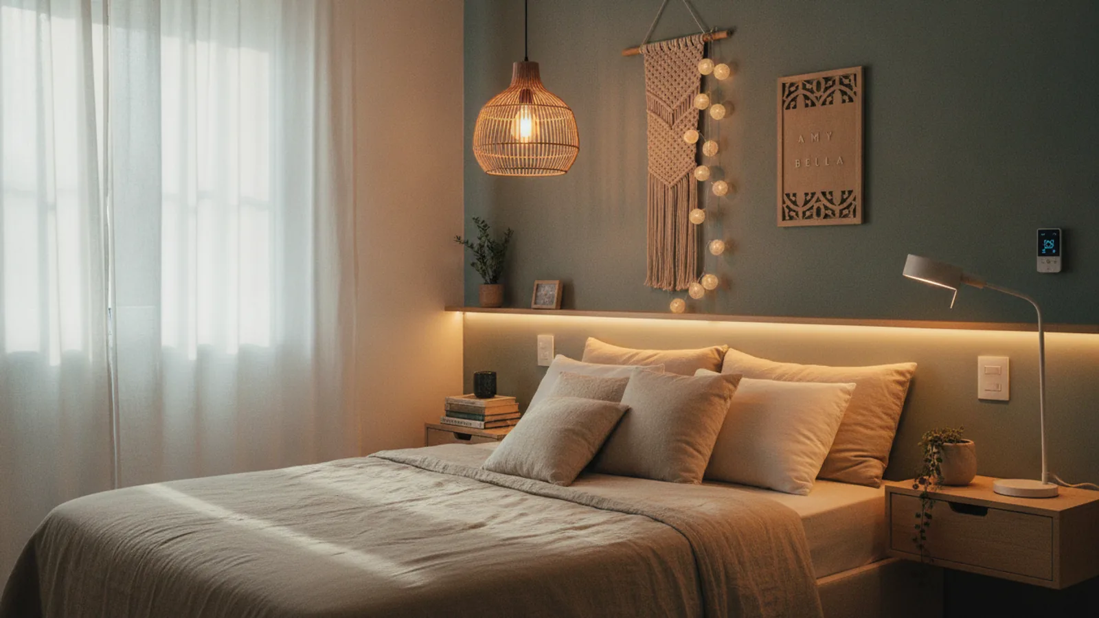
Small Bedroom Colour Ideas
A practical step-by-step guide to small bedroom colour ideas, including preparation, instructions, common issues, tips, and next steps.

Small Bedroom Colour Ideas
Choosing the right paint colour for a small bedroom can feel like a high-stakes decision. The right shade can make your space feel larger, brighter, and more restful, while the wrong one can make it feel cramped and dark. This guide provides a clear, step-by-step process for selecting the perfect colour palette. We'll walk you through understanding your room's unique lighting, using colour theory to your advantage, and testing samples like a pro to create a bedroom you love, no matter its size.
Fast Answer
- Best Strategy: Light, neutral colours like off-white, soft gray, or pale blue to reflect light and create a sense of space.
- Key Trick: Use a monochromatic scheme (shades of the same colour) for walls, trim, and even bedding to create a seamless, uncluttered look.
- Avoid: Overwhelming the space with multiple bold, dark, or highly saturated colours, which can make walls feel like they're closing in.
Before You Start
Proper preparation is the key to choosing a colour you'll be happy with for years. Don't rush this stage. Gathering the right tools and understanding your space's context will prevent costly and time-consuming mistakes.
- Paint Swatches or Sample Pots: Get samples of your top 3-5 colour choices. Do not rely on small paper chips.
- Poster Board or Foam Core: An alternative to painting samples directly on the wall. Paint a large square on two boards for each colour.
- Painter's Tape: To affix poster boards to the wall or to create clean edges for sample patches.
- Notebook and Pen: To jot down observations about how colours look at different times of the day.
- Smartphone Camera: Take photos of your room in various lighting conditions to help you analyze the space objectively.
- Existing Decor Samples: Gather fabric swatches from your bedding, curtains, or rugs to see how they coordinate with potential wall colours.
Step-by-Step Instructions
Step 1: Assess Your Room's Natural Light
The amount and type of natural light your bedroom receives is the single most important factor influencing how a paint colour will look. Determine which direction your main windows face, as this dictates the colour temperature of the light throughout the day.
- North-facing rooms: Receive cool, indirect light that can make colours appear bluer or grayer than they are. Warm whites, soft yellows, or creamy neutrals can help balance this coolness. Avoid cool grays, which can feel sterile here.
- South-facing rooms: Get bright, warm light for most of the day. This lighting is very forgiving and works well with almost any colour, from cool blues and greens to warm beiges and greiges.
- East-facing rooms: Have bright, warm light in the morning that becomes cooler and more indirect in the afternoon. A colour that looks great at 8 AM might feel flat by 4 PM. Choose a versatile colour that works in both warm and cool light, like a sage green or a complex neutral.
- West-facing rooms: Receive soft, neutral light in the morning that turns very warm and golden in the late afternoon and evening. Cool colours can balance the intense evening warmth, while warm colours will be amplified.
Spend a full day observing your room. Note how the light changes and how it interacts with your current wall colour.
Step 2: Define the Mood and Function
Before you even think about specific shades, decide how you want your bedroom to feel. Is it purely a sanctuary for sleep, or does it also function as a home office or reading nook? The intended mood will guide your colour family selection.
- For a Calm, Restful Sanctuary: This is the most common goal for a bedroom. Opt for cool, soft colours known for their calming properties. Think of shades like pale blue, sage green, soft lavender, or a light, cool-toned gray.
- For a Cozy, Enveloping Cocoon: If you want your small room to feel intimate and snug, you can strategically use a darker colour. A deep navy, charcoal gray, or forest green on an accent wall behind the bed can create a sense of depth and luxury without overwhelming the space.
- For a Bright, Energizing Space: If you need your room to feel cheerful and help you wake up in the morning, consider soft yellows, blush pinks, or a crisp, clean white. These colours reflect light well and create an airy, optimistic atmosphere.
Step 3: Choose a Core Colour Strategy
Now, translate your desired mood into a workable colour scheme. For small spaces, simplicity is key. Overly complex palettes can create visual chaos that makes a room feel smaller.
- Monochromatic: This is the most effective strategy for small bedrooms. It involves using different tints, tones, and shades of a single colour. For example, light gray walls, medium gray bedding, and charcoal gray accents. This creates a cohesive, seamless look that expands the space.
- Analogous: This scheme uses colours that are next to each other on the colour wheel, such as blue, blue-green, and green. It's serene and harmonious, offering more variety than a monochromatic scheme without being jarring.
- Light & Airy Neutrals: The classic approach. Off-whites, soft beiges, greiges (a mix of gray and beige), and pale grays are foolproof choices. They act as a blank canvas, reflect maximum light, and allow you to introduce colour through bedding, art, and accessories.
Step 4: Gather and Test Your Paint Samples
This is the most crucial step. Never, ever buy gallons of paint based on a tiny paper chip. You need to see how the colour behaves in your specific environment. Select 3 to 5 of your top choices and get sample pots.
Paint a large square (at least 2x2 feet) of each sample colour on a piece of white poster board. Create two sample boards for each colour. This method allows you to move the samples around the room without permanently marking your walls.
Place one board next to a window and another on a wall that receives less light. Also, place them near your headboard, trim, and any large furniture pieces to see how the colour interacts. Observe the samples over a 24-48 hour period to see how they look in morning light, midday sun, late afternoon, and with your artificial lights on at night. The colour you love at noon might look drab or cast a strange hue in the evening.
Step 5: Consider the "Fifth Wall" and Trim
Don't forget the ceiling and trim! How you paint them can have a massive impact on the perception of space in a small room.
- For Maximum Height: Paint the ceiling a crisp, flat white or a shade that is a few tints lighter than your wall colour. This draws the eye upward and creates an illusion of height.
- For a Seamless Look: Paint the trim, baseboards, and even interior doors the exact same colour as the walls. This technique, sometimes called "colour drenching," erases the visual lines and boundaries that can chop up a small space, making it feel larger and more unified.
- For a Cozy Effect: In some cases, painting the ceiling a darker colour can make a room with very high ceilings feel more intimate and less cavernous. Use this technique with caution in rooms with standard 8-foot ceilings.
Step 6: Select the Right Paint Sheen (Finish)
The finish of your paint affects both its durability and how it reflects light. In a small bedroom, the sheen can either help or hinder your goal of creating a serene space.
- Matte (or Flat): Has no shine and is excellent at hiding imperfections on walls. Its velvety texture absorbs light, which can create a very soft, calming effect. This is an ideal choice for most bedroom walls.
- Eggshell: Has a very subtle, low sheen that's more durable and easier to clean than matte. It's the most popular choice for bedrooms as it offers a good balance of aesthetics and practicality.
- Satin: Has a noticeable sheen and is very durable. However, its higher reflectivity can highlight every bump and flaw on the wall. It's best reserved for trim, doors, and furniture rather than all four walls in a small room.
- Semi-Gloss/Gloss: Highly reflective and durable, these are almost exclusively used for trim, doors, and windows. Using a gloss on walls can create distracting glare.
Quick Reference
| Situation | Use This Colour Strategy | Why |
|---|---|---|
| Room has little natural light | Bright off-white or a very light pastel | Maximizes light reflection to make the space feel brighter and more open. |
| You want a cozy, intimate feel | A dark accent wall behind the bed (e.g., navy, charcoal) | It creates a focal point and adds depth without making the entire room feel dark. |
| The ceiling feels low | Paint the ceiling a lighter shade than the walls | This visual trick draws the eye upward, creating an illusion of greater height. |
| The room feels visually cluttered | A monochromatic scheme (paint walls and trim the same colour) | It simplifies the visual palette and blurs boundaries, making the room feel larger and calmer. |
| You're afraid of choosing the wrong colour | A complex neutral like greige or a muted green | These colours have balanced undertones that shift beautifully with the light and complement many decor styles. |
Common Problems and Fixes
Problem: The Colour Looks Completely Different on the Wall
This is the most common issue, and it's almost always due to skipping the testing phase. A colour's undertones (the subtle hints of other colours within it) can be brought out by your room's specific lighting and decor. A gray might suddenly look purple, or a beige might look pink.
The Fix: There is no substitute for testing. If your chosen colour isn't working, identify *why*. Is the undertone wrong? If your gray looks too blue in your north-facing room, you need a gray with a warmer, more yellow or green undertone to counteract the cool light. Go back to the paint store armed with this new information to find a better-suited alternative.
Problem: The All-White Room Feels Sterile and Cold
Many people default to pure white, thinking it's the only way to make a small room feel bigger. While white is effective, without the right elements, it can feel clinical and boring rather than airy and inviting.
The Fix: Layering and texture are essential. Choose a white with a slightly warm undertone to start. Then, introduce a variety of textures: a chunky knit blanket, a linen duvet cover, a jute or wool rug, and wooden furniture. These elements add visual warmth and interest, making the white palette feel intentional and sophisticated.
Problem: The Room Still Feels Small and Claustrophobic
Paint is a powerful tool, but it can't solve everything. If you've chosen a light colour and the room still feels cramped, the issue may lie with your furniture and layout.
The Fix: Evaluate your other decor. Use mirrors to bounce light and create an illusion of depth. Choose furniture that is appropriately scaled for the room—a massive, dark wood headboard will shrink a room no matter the wall colour. Opt for pieces with legs (like a bed frame or nightstand) to create a sense of openness by allowing you to see the floor underneath.
Advanced Tips
Try Colour Drenching for a Designer Look
Take the monochromatic strategy a step further with colour drenching. This involves painting the walls, baseboards, window trim, crown molding, and even interior doors all in the same colour (and often the same sheen). This bold move completely erases the visual stops and starts in a room, creating a seamless, enveloping effect that can paradoxically make a small room feel much larger and more grand.
Use a Glossy Ceiling for Drama and Light
While matte finishes are standard for walls, painting the ceiling in a high-gloss or semi-gloss finish can be a stunning choice. The reflective surface bounces light around the room, much like a mirror or a body of water. It adds a touch of glamour and can make low ceilings feel higher. This works best on ceilings that are perfectly smooth, as gloss will highlight any imperfections.
Paint Horizontal or Vertical Stripes
Stripes can be used to manipulate the perception of space. Wide, horizontal stripes in two low-contrast colours (like a soft white and a pale beige) can make a narrow room feel wider. Similarly, vertical stripes can make a low ceiling feel taller. This requires careful taping and measuring but can be a high-impact solution for awkwardly proportioned rooms.
Small Bedroom Colour Ideas FAQ
What is the absolute best colour to make a small bedroom look bigger?
There isn't one single "best" colour, but the most effective choices are light-toned colours that reflect light well. Off-whites, pale cool blues, and soft, light grays are classic choices because they recede visually, making walls feel further away. The key is to pick a shade with the right undertone for your room's lighting.
Is it a mistake to paint a small bedroom a dark colour?
Not at all! While it's a bolder choice, painting a small room a dark colour like deep navy, charcoal, or emerald green can create a very cozy, intimate, and sophisticated feeling. Instead of trying to make the room feel big, this strategy leans into its size, creating a jewel-box or cocoon-like effect. It's particularly effective in rooms with good natural light to balance the darkness.
Should I paint the trim white if my walls are a different colour?
Crisp white trim is a classic look, but in a small bedroom, it can create strong lines that visually break up the walls and make the room feel smaller. For a more expansive feel, consider painting the trim the exact same colour as the walls. This creates a seamless look that helps the walls recede.
How does furniture colour play a role?
Furniture has a huge impact. Lighter-coloured furniture (white, light wood, light gray) will make the room feel more open than heavy, dark pieces. To take it a step further, furniture that blends in with the wall colour (e.g., an ivory dresser against an off-white wall) can help it "disappear," reducing visual bulk and making the space feel less cluttered.
Final Checklist for Choosing Your Colour
- Determined the direction your windows face (North, South, East, West).
- Identified the primary mood you want to create (e.g., calm, cozy, bright).
- Chosen a simple colour strategy (e.g., monochromatic, light neutral).
- Selected 3-5 potential paint colours and purchased sample pots.
- Painted large sample boards or patches for each colour.
- Observed the samples on different walls and at all times of day and night.
- Made a final decision on your wall colour.
- Selected a complementary colour and finish for your ceiling and trim.
- Chosen the correct paint sheen for walls (eggshell) and trim (satin).